Box Model
Introduction
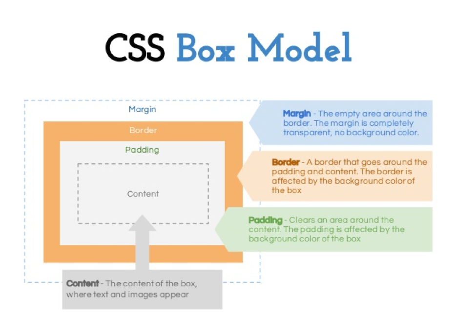
- The CSS box model is essentially a box that wraps around every HTML element. It consists of: margins, borders, padding, and the actual content.
Components
- Content - The content of the box, where text and images appear
- Padding - Clears an area around the content. The padding is transparent
- Border - A border that goes around the padding and content
- Margin - Clears an area outside the border. The margin is transparent
Every element on a page is a rectangular box.
Types of box model
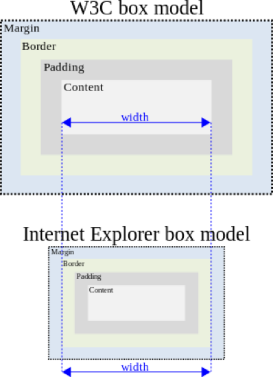
There are actually two types of box model, one is W3C standard, the other is IE model. Basically they all calculate the element width and height based on the content width, content height, padding and border, but their formula are different:
W3C standard
1
2
3
4
5
6
7
8
outer box (element space size)
Element space width = content width + padding + border + margin
Element space height = content height + padding + border + margin
inner box (element size)
Element width = content width + padding + border
Element height = content height + padding + borderIE box model
1
2
3
4
outer box (element space size)
Element space width = content width + margin
Element space height = content height + margin
(content width including padding and border)
- In order to make sure we apply the same box model to all browsers, CSS3 provides us with the new box-sizing property:
box-sizing: content-box || border-box || inherit
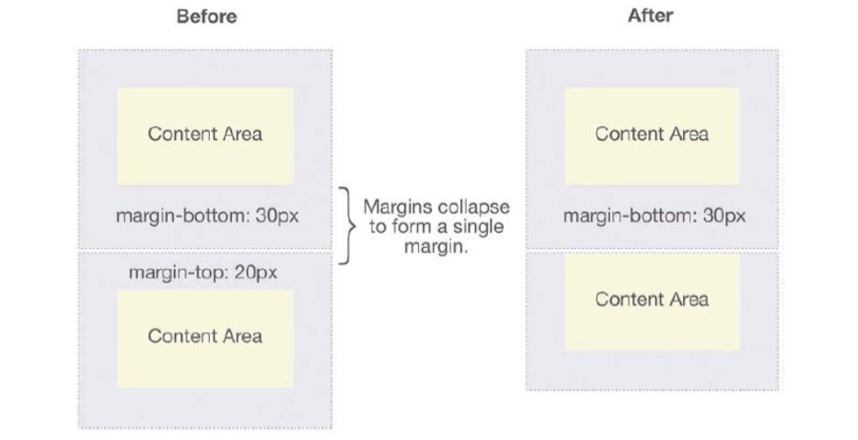
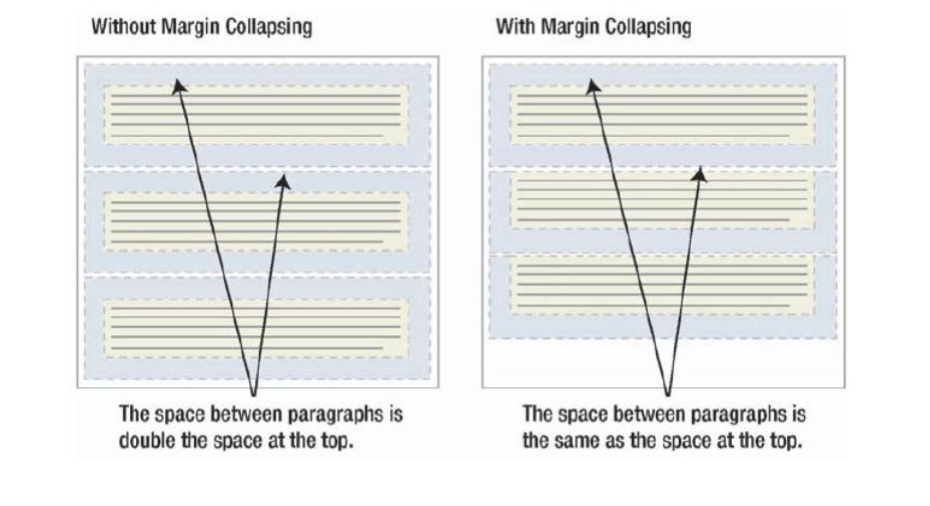
Margin Collapsing
Layout
- Definition: the “display” property
Block
- A block-level element starts on a new line and stretches out to the left and right as far as it can.
Inline
- An inline element can wrap some text inside a paragraph without disrupting the flow of that paragraph.
center element
- margin: 0 auto; Centers the block elements to the center of the container.
- text-align: center; Centers the text content.
- display:flex; justify-content: center; Centers the items in a flex box horizontally.
- display:flex; align-items: center; Centers the items in a flex box vertically.
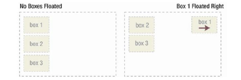
Floating
Definition
The float CSS property specifies that an element should be placed along the left or right side of its container, allowing text and inline elements to wrap around it. The element is removed from the normal flow of the web page, though still remaining a part of the flow.
How floated elements are positioned: when an element is floated, it is taken out of the normal flow of the document (though still remaining part of it). It is shifted to the left, or right, until it touches the edge of its containing box, or another floated element.
Syntax
float: none|left|right|initial|inherit;The float property can have one of the following values:
- left - The element floats to the left of its container
- right- The element floats to the right of its container
- none - The element does not float (will be displayed just where it occurs in the text). This is default
- inherit - The element inherits the float value of its parent
Important Facts
float first
When a container has multiple elements, some of them are floating, some of them are not, remember to put all the floating elements in front of the non-floating ones! Browsers try to figure out the spacing for those floating ones first.
clear
- The clear property specifies on which sides of an element the floating elements are not allowed to float.
.clear { clear: both; /* it can be left|right|both */ }
inline-block
Floating works great, but as you see we need to apply the .clear to clear out the floating even for a block element. There is another way to achieve the floating effect, that is to use inline-block display.
similar to inline, inline-block allows multiple elements to layout on the same line, the beauty of it is that elements can automatically wrap around if the wrapper container is too small, and if you add a block element right after an inline-block element, we don’t need to use the ugly .clear fix.
可实现左右排版
Position
static (default)
- Default value, means the element is not positioned! A static element is said to be not positioned and an element with its position set to anything else is said to be positioned.
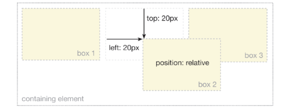
relative
- The top, right, bottom and left properties of a relatively-positioned element will cause it to be adjusted away from its original position. Other content will not be adjusted to fit into any gap left by the element.
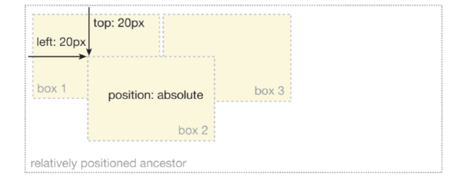
absolute
- The top, right, bottom and left properties of an absolute-positioned element will cause it to be positioned relatively to the nearest positioned ancestor.
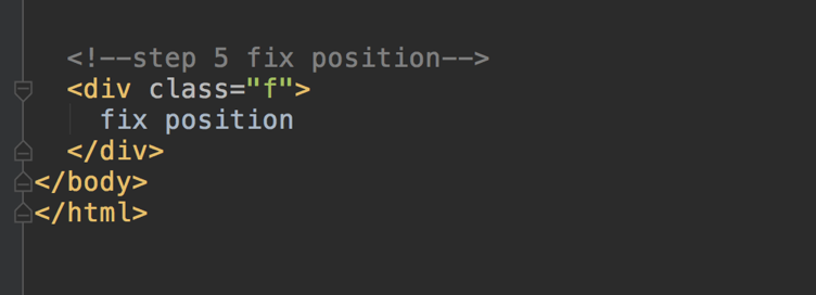
fixed
- A fixed element is positioned relative to the viewport, which means it always stays in the same place even if the page is scrolled.
Examples
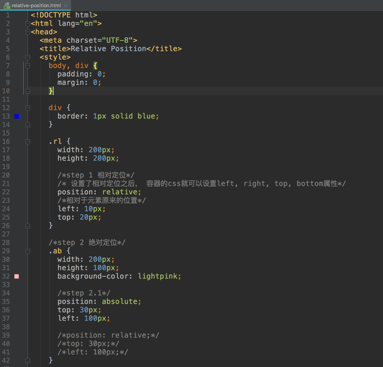
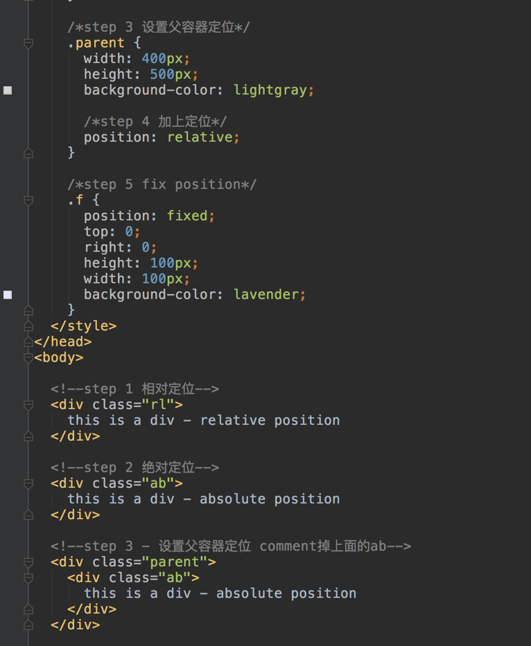
Trick: 子容器绝对定位(相对于父容器), 父容器相对定位。
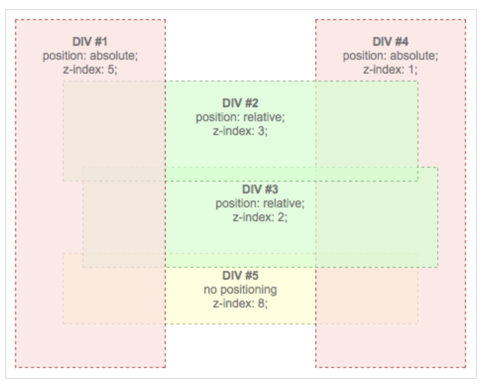
Z-index
Definition
The z-index property specifies the stack order of an element.
An element with greater stack order is always in front of an element with a lower stack order.
- Note: z-index only works on positioned elements (position:absolute, position:relative, or position:fixed).